International Charity and the importance of the UX Discovery phase

Client aim

They were Overcoming MS (OMS), a charity dedicated to promoting an evidence-based 7-step lifestyle recovery program for people living with multiple sclerosis (MS). Their goal was to be a globally recognised digital charity that could reach every single person with MS online and provide them with useful, easy-to-understand information about MS and the OMS Recovery Program. They wanted to enable people with MS to make informed choices about their health and empower them with the tools and resources they needed to make sustainable diet and lifestyle changes.

In order to fulfil this goal, the client recognised the importance of a UX discovery phase to understand the needs and behaviours of their target users. Their challenge was to achieve this ambitious goal while maintaining the personalised level of support and sense of community that OMS had become known for. They believed that a well-designed online platform was crucial in helping them achieve their mission of informing, educating, and empowering people with MS.

My role

As a UX Designer on the OMS website project, my main focus was on understanding the needs and behaviours of the target users through a thorough UX discovery phase. This involved conducting a diary study to gather insights and inform the design process.

Using different tools like Jenkins, I was able to optimise the OMS website for mobile traffic, resulting in a 30% increase in traffic from mobile devices. I also developed a series of life cycle emails that were triggered at key moments in the user journey to motivate and retain users at different stages of living with MS.
I worked with two off-shore Drupal developers to manage the project and ensure that it was completed on time and within budget.

To enable the website administrators and editors to create and edit content pages themselves, I used tools like Paragraphs and CK Editor. I also created a Design System to ensure consistency and reusability in the design of the website. Overall, my goal was to create a user-friendly and engaging online platform that helped OMS achieve its mission of informing, educating, and empowering people with MS.

Problem to solve

The OMS website was experiencing low donations through the website due to a lack of a cohesive design system, resulting in a disjointed user experience and difficulty for website administrators and editors to create and edit content pages.

The website also lacked clear and noticeable links for donating and options for recurring donations, as well as a simple and secure donation process. Without these features, it was difficult for the organisation to effectively encourage donations and support its mission.

Desired Outcome

Improve the overall effectiveness of the platform in informing, educating, and empowering people with multiple sclerosis. This included creating a cohesive and consistent user experience and making it easier for website administrators and editors to create and edit content.

The OMS website also implemented a clear and noticeable link for donating, as well as a simple and secure donation process. The organisation also provided options for recurring donations and the ability to dedicate donations in honour or memory of someone. By clearly explaining how donations would be used and providing credibility through third party endorsements and testimonials, the OMS website was able to effectively encourage donations and support the organisations mission of helping those living with multiple sclerosis.

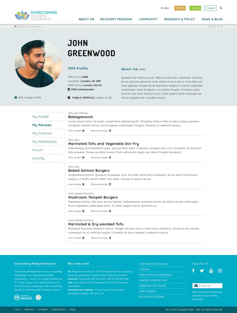
layout page for user profile with settings and favourite content
layout page of user profile with intro and other details

Discovery Phase

During the UX discovery phase for the OMS website, the team conducted preparatory research to gather insights on the organisation and its audience. This included internal interviews with OMS staff, reading industry-specific and general-interest magazine articles, and reviewing materials created by OMS in the past, such as their recovery program, recommended books, podcasts, conference materials, and FAQs.

To gain a deeper understanding of user behaviours and experiences, the team used a diary study method, where participants were given access to an online diary to record and describe relevant aspects of their lives over a period of a few days. This provided insights on users’ habits, usage scenarios, attitudes and motivations, changes in behaviours and perceptions, and customer journeys across various channels.

To validate and supplement these findings, the team also conducted focus groups, where participants discussed their perceptions, opinions, and attitudes towards the website and its tasks through a questionnaire. This provided valuable insights on changes that needed to be made to the sign-up pages, my account pages, and account activities.

Development Phase

As an UX Designer on the Overcoming MS (OMS) project, I worked closely with the development team to ensure that the design was implemented effectively and met the needs of the users. We used an agile approach, with regular sprints and stand-ups to track progress and identify any issues. Jira was our primary tool for managing the project, with Epics and Stories used to break down the work into smaller, more manageable chunks. I also provided regular updates and feedback to the development team, using wireframes and prototypes to communicate my design vision and ensure that we were all aligned on the goals of the project.

One of the key features of the homepage was the events layer, which displayed the lead event on the left and an upcoming events widget on the right. This allowed users to easily find out about upcoming events and purchase tickets.

The resources layer was a mix of resources such as recipes, exercises, meditations, and podcasts, which were organised into categories and tags for easy navigation. The community layer was divided into 4 columns and could be edited by the admin to display different images and calls to action as needed. The latest layer displayed a chronological overview of news and other topics.

Key interactions on the website included event bookings and ticket purchases, increased website registrations, online donations, and access to exercises and meditation zones. The recipes pages were designed to allow users to easily browse and filter through different recipes based on categories and tags, and included options for displaying quantities and nutritional labels.

Content templates were created for different types of content, including articles, recipes, exercises, meditations, podcasts, FAQs, and a logged-in user page. To support email marketing and fundraising efforts, the website was integrated with MailChimp and included an online payment system for donations, with the ability to track transactions and manage refunds.

layout page of description mission of the charity
layout of charity's homepage website