
Portfolio
Overcoming MS (OMS) is an international charity promoting an evidence-based, seven-step lifestyle programme for people living with multiple sclerosis.
Its ambition was to become a globally recognised digital charity, capable of reaching people with MS wherever they were, while maintaining the personalised support and sense of community that defined the organisation.
The challenge was not simply to publish information online, but to support informed decision-making and sustained behaviour change in a context shaped by uncertainty, fluctuating health, and cognitive and emotional load.
OMS recognised that achieving this required a research-led UX discovery phase to understand how people with MS seek information, manage energy, and engage with support over time.
Project context
Challenge
The existing website struggled to support OMS’s mission at scale.
Key issues included fragmented content structures, a lack of a cohesive design system, low conversion through digital donations, and high dependency on administrators for content updates.
More fundamentally, the platform did not sufficiently reflect the real-life constraints of people living with MS, including fatigue, variable attention, and the need to revisit information over time.
The core challenge was to design a platform that balanced clarity, credibility, and compassion, while supporting both educational goals and organisational sustainability.
Case study section
Discovery Phase
To move beyond assumptions, the discovery phase centred on a diary study, allowing participants to document aspects of their daily lives over several days.
This method surfaced:
- Fluctuating energy levels and attention across the day
- Non-linear information needs, with frequent revisiting of the same content
- Emotional sensitivity around health-related decisions
- Reliance on mobile devices for short, fragmented sessions
The diary study provided insight into how and when people engaged with information, not just what they sought.
Supporting methods included internal interviews with OMS staff, reviews of OMS materials, and focus groups validating early findings and testing assumptions about key tasks.
Focus group feedback highlighted friction in sign-up and account creation, “My account” areas and saved content, and understanding how to progress through OMS resources over time.
Process and method
Strategy
The UX strategy focused on reducing cognitive load while increasing trust and continuity.
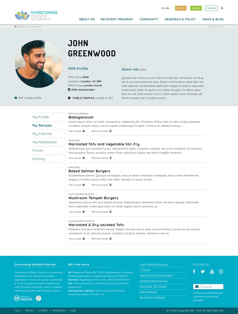
Structuring for Clarity and Return Visits
Information architecture was redesigned to group content into predictable, clearly labelled templates, support scanning and short sessions without losing context, and allow users to save and return to content over time.
User profiles enabled favourites and personalised access, reflecting the need to engage gradually rather than all at once.
Designing for Mobile-First Reality
Given diary-study insights, mobile experience became a priority. Optimisation work contributed to a reported 30% increase in mobile traffic, reflecting improved accessibility and usability rather than acquisition-driven growth.
Supporting Behaviour Over Time
Rather than relying on one-off interactions, the platform introduced lifecycle emails triggered at meaningful moments in the user journey. These were designed to reinforce motivation, encourage return visits, and support sustained engagement without pressure.

Case study section
Design System and Content Enablement
A core constraint was OMS’s need to update and manage content independently.
To address this, I:
- Created a simplified design system to ensure visual and structural consistency
- Designed modular content templates for articles, recipes, exercises, meditations, podcasts, FAQs, and events
- Implemented Paragraphs and CK Editor to allow editors to create and update pages without developer intervention
This reduced reliance on technical support and enabled faster iteration while preserving quality.
Case study section
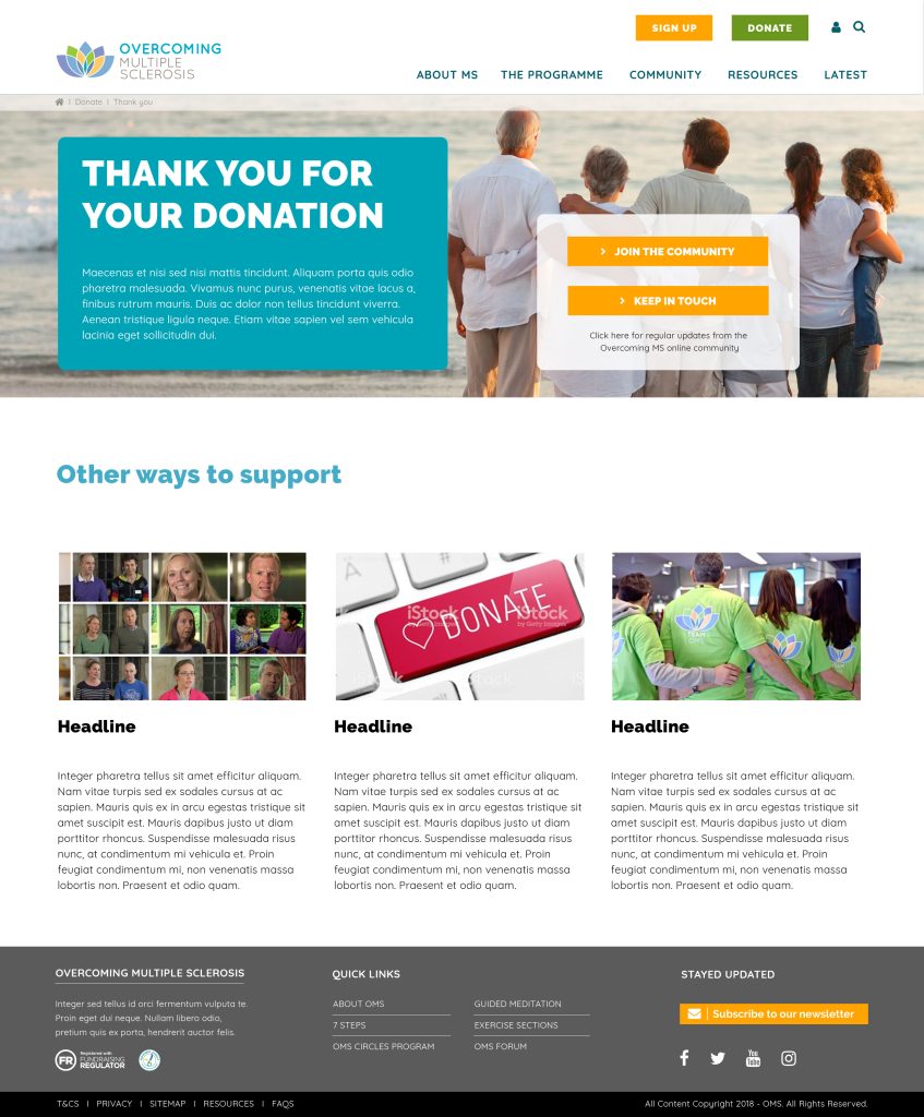
Donations and Trust Signals
Donation flows were redesigned to reduce friction and increase clarity.
Key improvements included:
- Clear, visible donation entry points
- Support for recurring donations
- Options to dedicate donations in honour or memory
- Clear explanations of how funds are used
- Use of testimonials and third-party endorsements to reinforce credibility
These changes aligned fundraising with OMS’s educational mission, avoiding pressure while supporting sustainability.


Result and impact
Outcome
The redesigned platform strengthened OMS’s ability to deliver on its mission digitally.
User Impact
- Clearer access to information and resources
- Improved mobile usability for fragmented sessions
- Better support for revisiting and saving content
Organisational Impact
- Greater editorial autonomy for OMS staff
- More consistent experience through design system adoption
- Improved alignment between content, community, and fundraising goals
The platform evolved from an information repository into a supportive digital environment shaped around real user behaviour.
Reflection
Reflection
This project reinforced that designing for health-related contexts requires more than clarity and aesthetics.
Effective UX in this space means respecting fluctuating capacity, designing for return rather than completion, and supporting trust without persuasion.
By grounding decisions in lived experience through diary studies, the platform shifted from telling users what to do to supporting them as they navigate complex, personal decisions over time.