Repair in Customer Service

Introduction

The Company’s brand built on durability, but even the most resilient products need care. In the US, the repair experience was disjointed: hosted on a separate domain, lacking account integration, and placing undue pressure on customer service.

As the UX lead for the project, my goal was to design a repair journey that reflected the same precision and reassurance as the products themselves. What began as a patchwork service flow evolved into a guided, branded, and flexible digital experience for B2C customers, employees, and retail partners.

Challenge

The existing experience surfaced three core issues:

Fragmented flow: The repair site was not integrated into the main domain and lacked login/account features.
Operational strain: Confusion in the request process drove up customer service load and manual handling.
Missed brand opportunity: The tone and interface didn’t reflect Company’s premium positioning—especially in moments of product failure or frustration.

We needed to create a customer self-service experience that was smooth, informative, and respectful of users’ time and trust.

Strategy

Our UX strategy was shaped around four priorities:


Human-Centred Content

I created a new content system to support the full journey, from entry to confirmation. It balanced clarity, reassurance, and tone to guide users through an emotionally delicate moment with dignity.


Tiered User Access

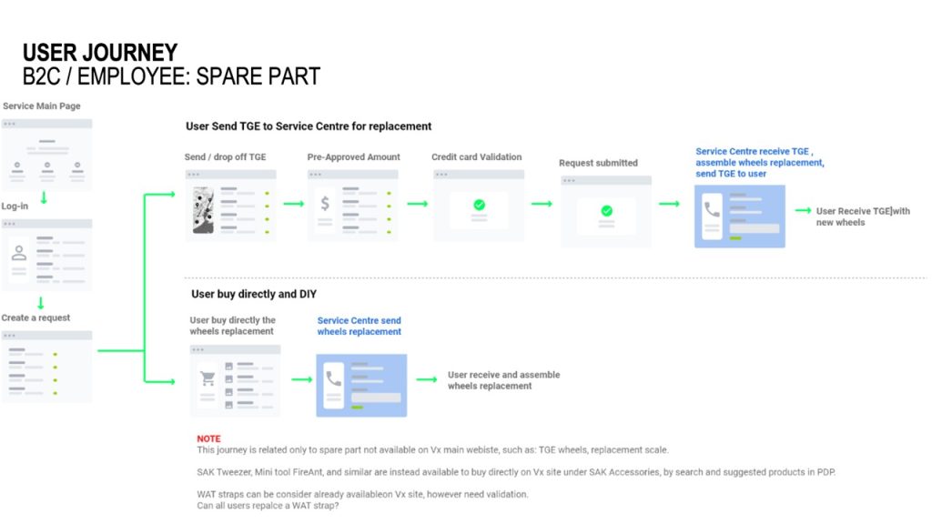
We differentiated journeys for B2C customers, employees, and retailers. While visually consistent, each flow presented context-aware steps, language, and inputs. Employees used ID numbers; retailers saw walk-in workflows.


Seamless Service Integration

We aligned the repair portal with users’ accounts (where possible) while also allowing for guest access—mirroring best practices from eCommerce checkout flows.


Modular, Step-Based Forms

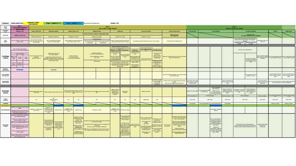
The repair flow was structured into clear steps (product details, user identification, shipping, pre-approval, confirmation) that could adapt dynamically to user type or service selection.

Execution Highlights

Entry Point: Repair Landing Page

Defined as the new service hub, integrated within the main domain
Gave users immediate, clear choices: log in or continue as guest
Included reassurance content: estimated repair time, spare part ordering, and a brand-aligned tone of care
Created flexible entry points via site search, navigation, or redirects


Step 1: Product & Issue

Used plain language fields to help users describe the issue or attach photos and documents
Allowed users to tag repairs as “sentimental,” “functional,” or “warranty-related” to shape CS response tone
Input fields adapted by product category or service type


Step 2: Shipping Options

Offered drop-off or send-in methods with dynamic instructions
Integrated retailer locator tool to assist in finding nearby service centers
For spare part replacements (e.g. suitcase wheels), supported DIY-style delivery with clear install instructions


Step 3: Pre-Approved Amount

Displayed estimated cost based on inputs, with the option to edit before final submission
Added disclaimers for shipping responsibilities and packaging quality
Connected this quote to downstream approval flows


Step 4: Approval / Rejection Logic

Enabled users to accept, reject, or counter proposed repairs
Built-in fallback options like replacement discounts
Added optional services and upsells (e.g. tune-ups or cosmetic fixes)


Repair Listing Dashboard

Created logged-in repair overview with filterable columns by status, date, and location
Designed views specific to retailers and employees, with extra functionality (e.g. client linkage)

Outcome

The redesigned repair experience redefined what after-sales service could feel like:

  • CS support tickets dropped, with more self-service usage and cleaner inbound requests
  • Customers reported less confusion and more confidence through the process
  • Mobile-first design enabled repairs to be initiated from any context, including directly from product pages or receipts
  • The tone shift, from “submit your issue” to “let us help you care for your product”, strengthened brand affinity in an often-neglected space

Reflection

Repairs aren’t glamorous, but they’re emotional. They happen when a user’s trust has been tested. This project taught me that UX in these moments isn’t about apology, it’s about assurance.
By building clarity, tone, and operational logic into the repair flow, we didn’t just reduce friction, we created a small moment of brand restoration. And in many ways, that’s the true purpose of UX: to make the hard parts feel easier.